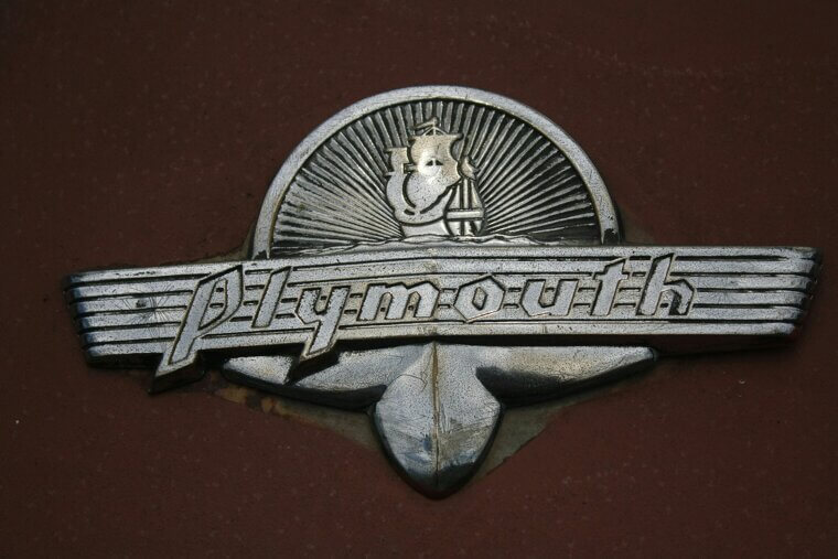
Plymouth
For most of its history, the sailing ship ‘Mayflower’ featured on Plymouth’s logo. It was featured on radiator grills and as a hood ornament in various styles until the early 1960s. In the mid-1960s, it adopted Chrysler’s five-pointed Pentastar.
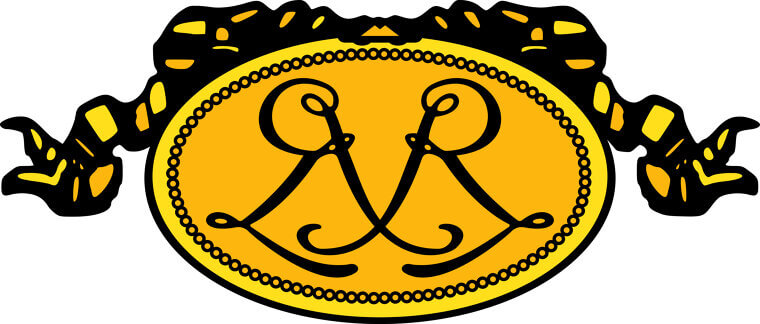
Renault
Louis Renault's earliest logo designs were decorative medallions fit for jewelry boxes rather than engine hoods. The Renault brand even featured a tank during World War I. Finally, in 1925, they finalized a design similar to the shape of their signature grille.
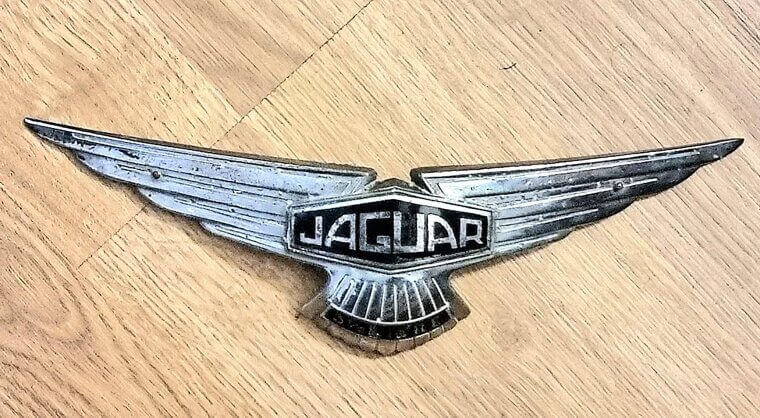
Jaguar
Before its iconic leaping cat hood ornament and grille “growler” badge, Jaguar’s emblem featured simple winged badges. In 2024, the company rebranded for its electric future, adopting a minimalist wordmark and an angular cat emblem. We all know how that worked out…
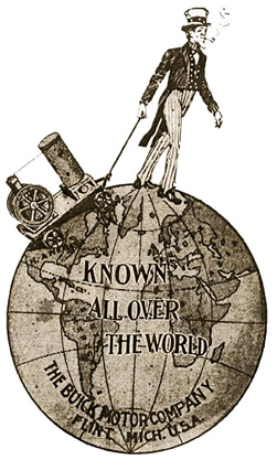
Buick
David Dunbar Buick's first logo was very different from the clean tri-shield we know today. From 1904 to 1905, the company logo featured a man walking on a globe, also known as “Uncle Sam.”
Audi
Audi’s logo began as a simple wordmark in 1910. Then, in 1932, Audi merged with Horch, DKW, and Wanderer to form Auto Union, adopting four interlocked rings as their shared emblem. Although Audi changed its logo a few times after that, the iconic four rings always returned.
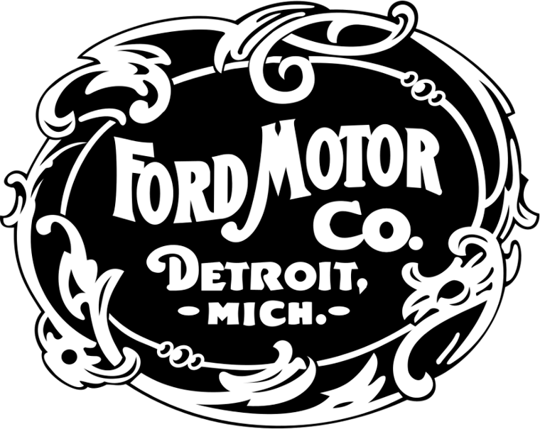
Ford
Ford’s first logo was excessively Victorian, and far from the clean blue logo we know today. It was like looking at a baroque business card, and certainly didn’t fit the brand’s personality of manufacturing automobiles.
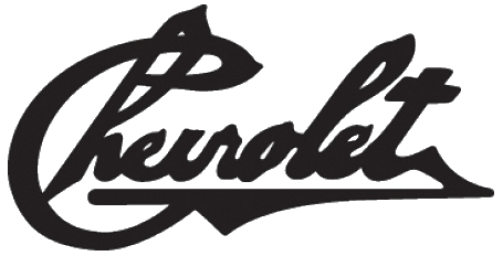
Chevrolet
Louis Chevrolet's first logo looked like it could cut you. It lasted only two years, though, and in 1913, Chevrolet introduced their iconic “bowtie” logo. Marketing legend has it that William C. Durant was supposedly inspired by an infinite pattern design on a Parisian hotel wallpaper in 1908.
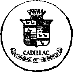
Cadillac
The first Cadillac logo featured the coat of arms (and name) of Antoine de la Mothe Cadillac (the French founder of Detroit). It included swimming ducks, tulips, and medieval heraldry; basically, everything except automotive themes.
Let’s take a look at these American legends’ siblings…
Let’s take a look at these American legends’ siblings…
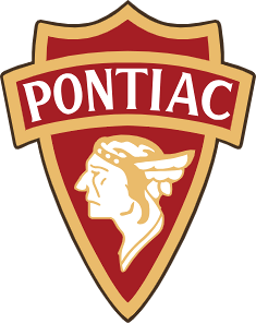
Pontiac
Pontiac’s earliest logos featured a Native American chief in full headdress, honoring the Ottawa leader Chief Pontiac. In the 1930s, the design was simplified into a streamlined, silver colored shield. In 1957, Buick changed it to a subtler and more modern red arrowhead, which became known as the “Dart”.
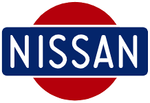
Nissan
Nissan's logo journey started with a "rising sun" design, paying homage to its Datsun heritage. Then, in 1933, they went with a red circle and a blue rectangle to represent Japan. In 2020, Nissan streamlined it with a cleaner design.
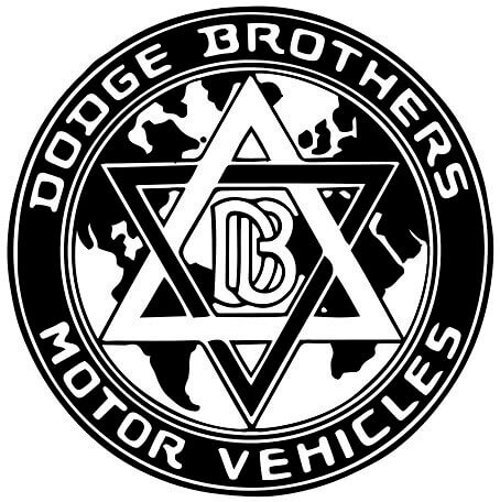
Dodge Brothers
Dodge’s emblem evolution began with the interlocked ‘DB’ initial, which later also featured a five-pointed star. They also used a leaping ram hood ornament from the 30s to the 50s, before moving on to a quirkier design in the 60s known as Fratzog.
Lincoln
The Lincoln logo’s story is a neat little evolution. The first featured a coat of arms, before shifting to the now-iconic four-pointed star in the 1950s. The star, sometimes enclosed in a rectangle, has been the primary emblem since the 1960s, evolving with minor refinements.

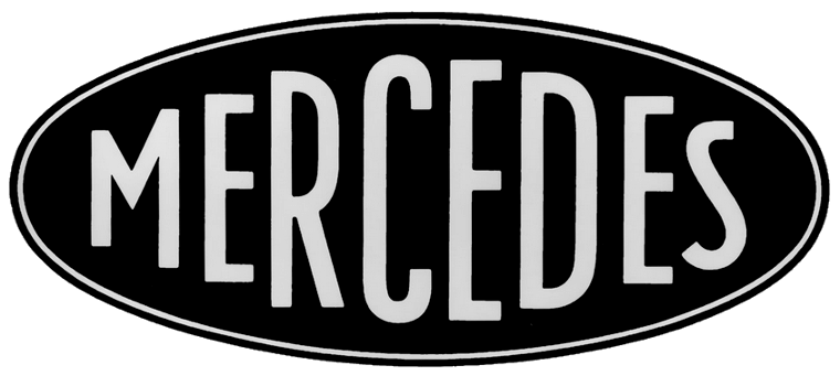
Mercedes-Benz
Yes, the earliest Mercedes' emblem did not feature a star. Instead, it featured the brand name in an elegant yet simple typeface. It wasn’t until 1909 that the famous three-pointed star made an appearance, representing the company’s ambition of producing engines for land, sea, and air.
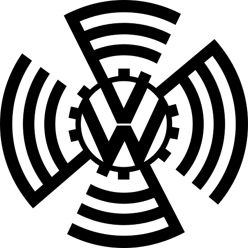
Volkswagen
The original KdF-Wagen badge featured harsh gear teeth around the VW; an ode to industrial brutalism reflecting the Nazi regime's aesthetic. The cog-wheel design was changed post-1945, though, being replaced by a beige circle with a brown outer ring.
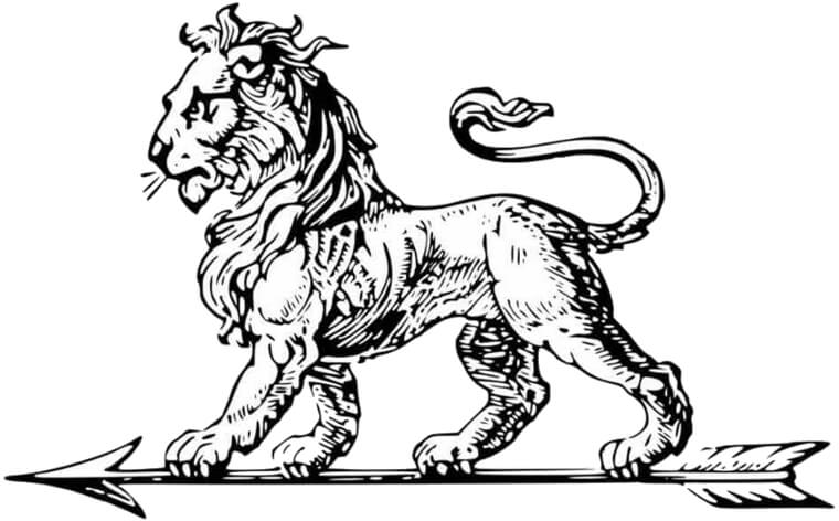
Peugeot
Peugeot’s original lion wasn’t sleek at all. It was an engraved, full-bodied lion walking on an arrow. That is because Peugeot worked with steel before building cars. The walking lion symbolized their blade quality, strength, and cutting precision.
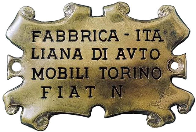
Fiat
Fiat's logos have evolved from intricate Art Nouveau parchments to bold geometric designs. Their most notable emblems include a blue rectangle in 1901 and a racing-inspired laurel wreath in 1921. Their most recent designs feature a retro-shield logo and the current minimalist wordmark.
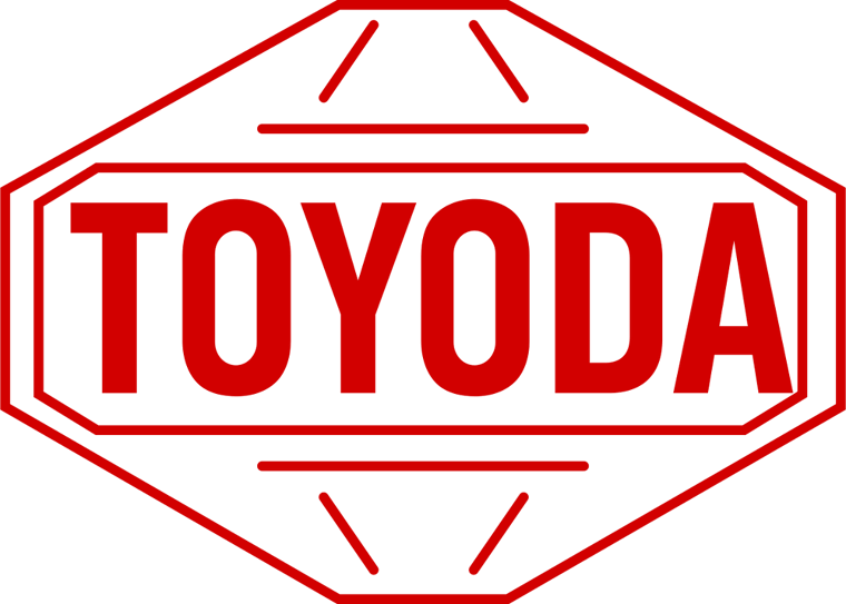
Toyota
Toyota's logos evolved from a Japanese wordmark based on its founder's name, "Toyoda," to its globally recognized triple-oval emblem. The overlapping ovals, introduced in 1989 for its 50th anniversary, represent the hearts of the customer and the company, and together form a "T".
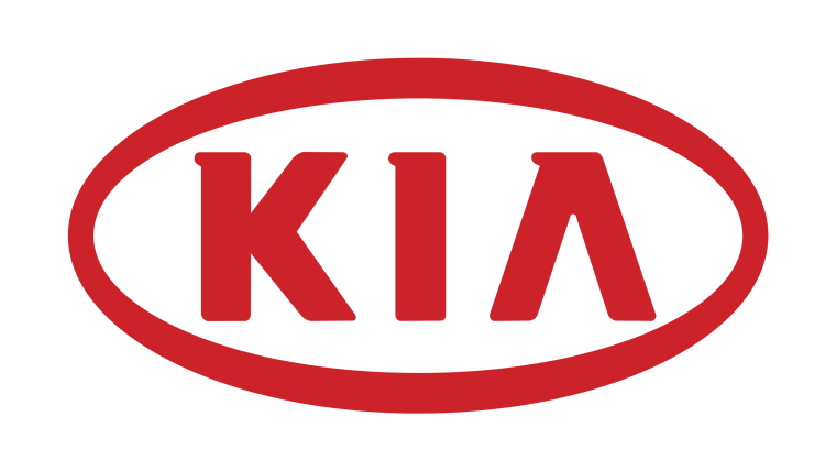
KIA
Kia's logo has come a long way from its early crests to the oval badge most people remember. Quite the transformation for a company that started making bicycle parts and grew into a major car brand. Their 2021 logo redesign represented a new identity for the company: a sharp, continuous “KIA” wordmark that represented modernity and futurism.
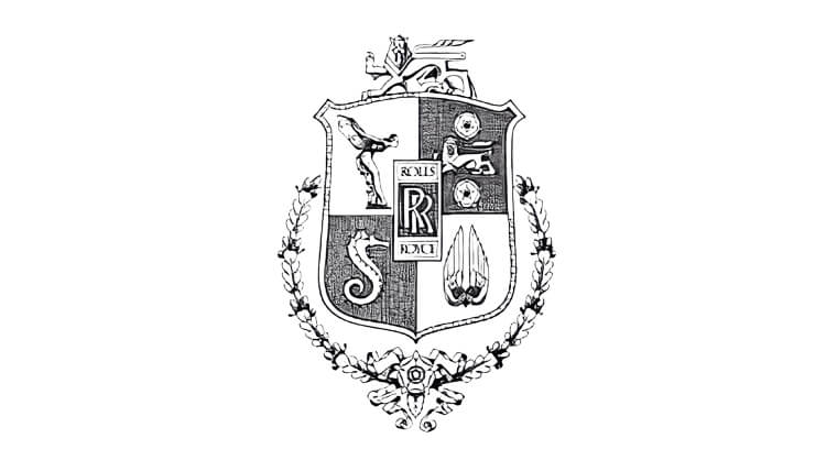
Rolls Royce
The first Rolls-Royce logo was exceptionally intricate. It still had the two iconic “R”s in the centre, but was also surrounded by lots of… details. The iconic “Spirit of Ecstasy” hood ornament made its first appearance in 1911 and has remained a constant symbol of luxury, with a refreshed and more aerodynamic design appearing in 2023.
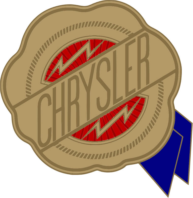
Chrysler
Chrysler’s logo journey is a story of three symbols: the winged emblem, the Pentastar, and the seal. The company’s first logo featured a golden wax seal until the famous five-pointed Pentastar was introduced in 1962, becoming the company’s corporate symbol for decades.